AT 309 Lab 4: Exploring Satellite Imagery
Introduction
Electromagnetic energy is radiation that consists of alternating electric and magnetic fields. This type of energy comes in waves that travel at the speed of light. These waves can travel at various wavelengths and frequencies. Depending on these two factors, it changes the micrometers and the type of electromagnetic radiation that is being given off. The typical range we can see is from 0.4 micrometers to 0.8. Figure 1 visualizes the spectrum and highlights the portion humans can see, which was provided by PhysicalGeography.net.
Methods
For us to pull the satellite images, we used ESRI Landsat Explorer, which is a web app that enables users to use Landsat imagery driven by publicly accessible image services. A tutorial was followed for the lab so that we could become familiar with using the software. We got to explore the different bands and what each one shows. Along with the use of ESRI Landsat, we got to learn more about the importance of temporal resolution as well; it is a given that time goes on and that the world changes. For satellites, it has a lower temporal resolution since it has to go around the whole globe before it reaches the same point, and they don't always get to that point due to their trajectory and the way the Earth moves. By implementing UAS within the remote sensing industry, it allows for temporal images to enter the market.
Discussion
At the beginning of the tutorial, we were instructed in using an infrared band; as stated in the last post, this band helps to see healthy plants in a deep red color, while everything else is a teal/blue color. Figure 2 is an image of Purdue University's agricultural area in infrared.
Figure 2: The agriculture within Purdue University is extensive, but this also shows the surrounding agricultural areas.
As we can see, a lot of the vegetation in the area happens to be healthy and there's lots of it. There are multiple ways to see vegetation within the remote sensing industry. Some of the examples deal with moisture index, infrared, agriculture, etc. We got to dive deeper into the agriculture band and what it shows us. Figure 3 shows an example of it.
Figure 3: The right side of the image displays the vast amount of agriculture within the U.S. plains and the large difference between land being utilized and what is not.
As we can see, the area of agriculture is extensive and holds lots of data that researchers can use. Now, let's look into an area that is not as agriculturally-rich. Figure 4 shows the southwest area of California.
Figure 5: This shows an area of southwest California that has a good amount of mountains.
Not as green isn't it? There isn't much data in terms of agriculture, but for the small number of spots, it gives researchers an idea of where agriculture is located in areas where it is not likely. Remote sensing holds rich data that can be highly useful.
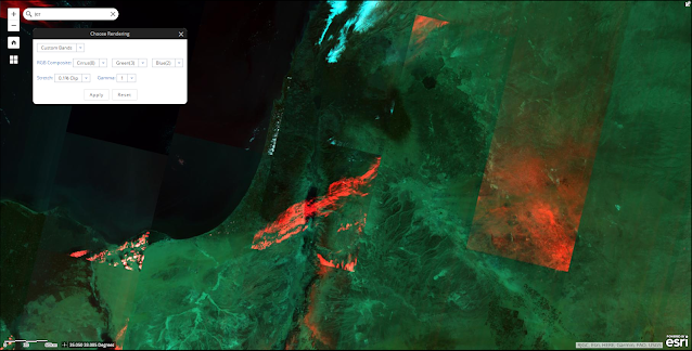
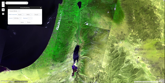
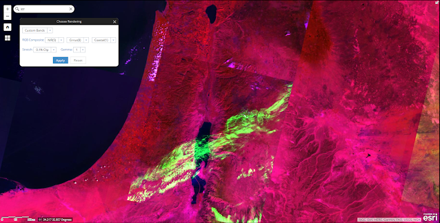
The next section of the lab consisted of creating our own bands and determining what they are showing. For reference, the images taken were above Jerusalem. Below is the table I created to show the various values within each color value.
The way it is structured is the columns represent a standard value and what bands are within each color. Everything else within the data is what values are within each color. For clarification, red/green/blue is what it is, cirrus shows cirrus clouds, NIR is near-infrared, coastal is shallow water and fine dust particles, and SWIR2 is short wave infrared 2 that shows improved (Compared to the first variation) cloud penetration and soil/vegetation moisture. Without further ado, the bands are shown below in Figures 6 through 10.
Figure 6: This band shows cirrus clouds in red with the other color values the same.
Figure 7: This band shows cloud penetration and soil moisture in the blue value.
Figure 8: This band shows NIR in green.
Figure 9: The band shows costal in the blue value.
Figure 10: This crazy looking band has NIR for red, cirrus for green, and costal for blue.
Conclusion
The use of ESRI Landsat Explorer was beneficial in understanding the different ways to utilize satellite imagery. They are beneficial to use since they carry so much data and there is not a need for building up infrastructure since the application is web-based and has a public library of bands. It also helped to become aware of temporal resolution because it allowed us to see images of areas that changed over time. Although it is not shown or explicitly mentioned, we can assume that satellites lack in the temporal area since they have to complete a whole orbit before reaching back to the same area. UAS would be viable for this type of remote sensing since it does not require large amounts of infrastructure and can be deployed right on the area.


Comments
Post a Comment