AT 309 Lab 6: ArcGIS Pro
Introduction
The labs so far have covered various ways to use satellite imagery and the different features of remote sensing. During this lab, we got to use ArcGIS Pro to look into imagery acquired through UAS. Along with that, we got to learn the different color bands and possible combinations that can be used. Each color band and combination that was looked at was asked to see what stands out.
Methods
To do this lab, students were given a brief introduction to using ArcGIS Pro and the different features it offers. After given the introduction in the lecture, students were tasked with following a step-by-step guide in exploring various features. Towards the end of the lab, students were tasked with creating their own color band combination and the results of such. Below, the lab is discussed further.
Discussion
At the beginning of the lab, we were tasked with looking into each band that the data set had to offer and look into reflectance values. Figure 1 shows the Martell Forest area that was used (Note: The software at the time of the image taken was not working properly, which in turn, made the forest image at an angle and cut off).
Figure 1: This is an aerial, RGB image of the Martell Forest that was being studied.
As you can see, it is a standard image that shows how we would see the forest with the naked eye. The images, before generating that RGB image, were black and white and only showed darker areas that reflected that certain color band at a higher value.
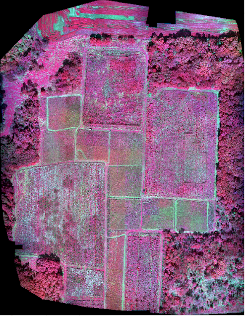
To create images that could be processed with multiple bands, we got to use the multiband composite function. What it does is bring multiple color bands and bring them together to create actual color images. When generating the RGB image, the color bands became numbered based on their order of the electromagnetic spectrum and their reflective values. For example, to create an RGB image, red would be band one, green is band two, and blue is band three (It is also mentioned as 1,2,3, with the numbers relating to the numbered band and position relating to the color value). Relating back to previous labs, we got to create the false-color IR imagery by assigning different bands to different color values. In the data set, band five became the Near IR (NIR) band, so to create that set, the order would be 5,3,2. This would make red display the NIR band, green shows blue, and blue shows green. Figure 2 shows the False IR image generated in the field before some spots were burned.
Figure 2: This shows the Martell Forest in False IR; as we can see, some of the fields give off a lower infrared signature.
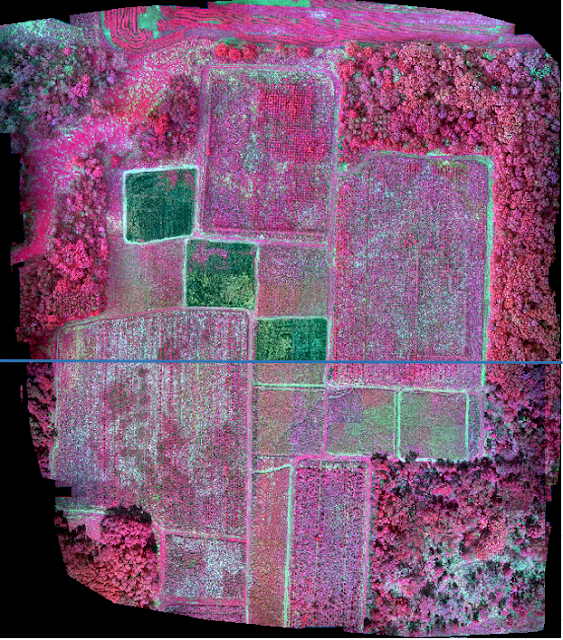
Later in the day that these were taken, parts of the field were burned. To show a comparison of the image above to after the burns, Figure 3 will show the two images using the swipe tool.
Figure 3: As we can see, the light green areas are now deeper, since they do not give off a whole lot of NIR energy.
The use of color bands and using them to create multiband composite is useful because it allows users to look at different types of data all at once, rather than having to pull up multiple bands at once at a time. Scientists have used these composites to calculate indexes in ways to simplify data. The most common index is NDVI, which uses the NIR band to display plant health. In this lab, we got to briefly look into the NDVI band and compare it to the False IR image created. Figure 4 shows just that.
Figure 4: The image above shows NDVI on top, with the False IR at the bottom; the relationship in the two is closely connected as in both the burn spots are darker.
The data in both are similar, but the NDVI is shown in black and white. Since the NDVI data is an index of NIR, it would show similar data and obvious similarities. The index would be better to use in this scenario since burnings were being performed to better remove unhealthy or dead plants.
Since we got in the hang of using color bands and creating composites, the final task of the lab consisted of creating a color band of our own to study this area. Figure 5 shows the color band that I created.
Figure 5: The configuration of this image was 3,1,5; which is red shows blue, green shows red, and blue is NIR.
Essentially, the combination of the bands creates a close-to-opposite version of the False IR. The data it shows is close to the opposite of the False IR image, with the exception of the burnt spots. It still shows them in a green color that stands out from the rest. By using color bands to inspect geospatial data, it allows for the user to utilize and maximize their output on remote sensing software, such as ArcGIS Pro.
Conclusion
To summarize, the use of ArcGIS Pro was very useful in learning the different tools this software has to offer, even when just barely scratching the surface of what it has to offer. It is still valuable within the UAS industry because it gives a lot of tools to use that would be useful for computations of various data acquired. The bridging of these two industries proves to be beneficial to both because it give the satellite imagery


Comments
Post a Comment